Notes on cone 6 clay bodies, part 1

One of the things I love most about working in a community studio is hearing about other ceramicists' experiences with new-to-me clay bodies. This has helped me feel confident in trying out many different clay bodies, and I now use a bunch of different clay bodies in my practice.

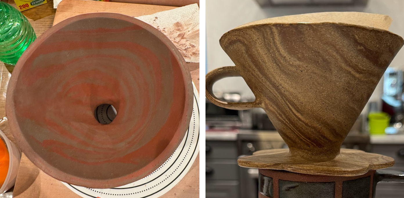
Yet there are too few commercial clay body reviews out in the world, even if you deep dive various topical forums! I figured my blog might be a good place to pass along my experiences to other interested ceramicists, and I'll be starting with some colored stoneware offerings from Standard Clay Company today. I like working with each of these clays individually, and they also work well marbled together!

Standard 308 looks like a bright red as greenware, but the other three clays - 112, 211, and 760 - all look similar as light grey brown as greenware. When fired, all the colors are distinct.
Standard 112, 211, 308, and 760 marbled together: as moist greenware on the left, fired to cone 6 and left unglazed on the right

Note that I practice in a studio that glaze fires to cone 6 in oxidation, so my observations reflect that.

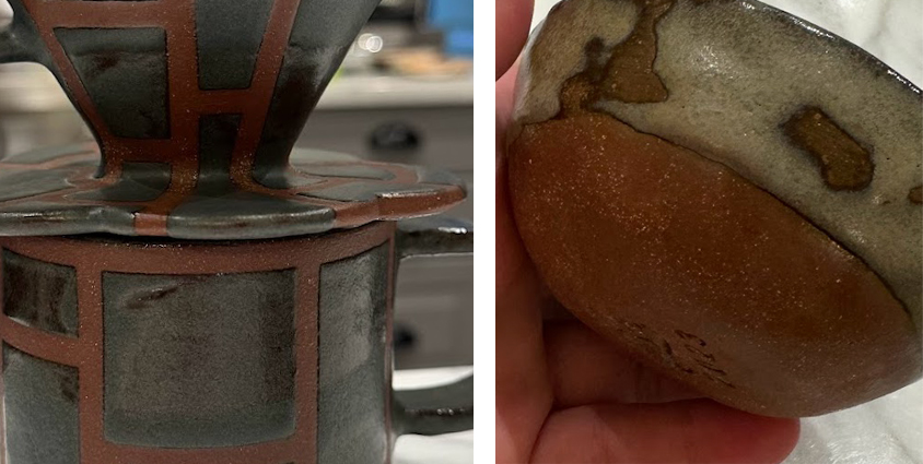
Standard 760 Speckled:

  • Cone 6: average shrinkage 13.5%, absorption 3.0%
  • My community studio calls this color "sand" for a reason: it looks like wet beach sand when fired because of its grey-ish tan speckled color
  • The speckles in this clay don't show through translucent glazes like the ones in 112.
  • Very plastic
  • Has some extremely fine grog, which is unnoticeable when throwing
  • OK for handbuilding, but doesn't have the same level of stability as clays with more fine grog or larger grogs.
  • When I'm slab-building with this clay, I prefer to let my slabs firm up before assembling and reinforcing with coils. Slab-built pieces also need a long, slow dry to minimize warping.
  • Marbles well with 112, 211, and 308 - just make sure to dry slowly.
Standard 760 looks like grey wet beach sand
Two examples of what Standard 760 fired to cone 6 looks unglazed

Standard 112 Brown:

  • Cone 6: average shrinkage 11.0%, absorption 2.25%
  • My community studio calls this "speckled" for a reason: it's light brown with black speckles that can show through glaze formed by granular manganese. It's very popular at my studio for its ability to turn lots of glazes into speckled glazes!
  • I find the orange-y salt flashing on this clay especially beautiful, especially in my tape-resist work.
  • Medium amount of grog: noticeable while throwing and not as supportive while handbuilding as 211 or 308
  • When I'm slab-building with this clay, I prefer to let my slabs firm up before assembling and reinforcing with coils.
  • Once this clay dries out some, it can be a little finicky to rehydrate back to plastic quickly: best to spray and slam repeatedly and leave overnight, in my experience
  • Marbles well with 211, 308, and 760 - just make sure to dry slowly.
The speckles formed by the granular manganese in Standard 112 show through translucent glossy white and a glossy white layered over celadon on the left, and they also show through a light shino on the right. They are more circularly shaped in the flat plate, and they show more movement in the sloped shape of the interior of a coffee cone.
Two examples of the granular manganese in Standard 112 showing through translucent glazes
Some glazes bring out a lovely orange-toned flashing on Standard 112, while other glazes where it doesn't flash shows a duller speckled light brown where tape resist was applied.
Flashing from salt in glaze on a tape resist piece on the left vs. no flashing on the right on Standard 112

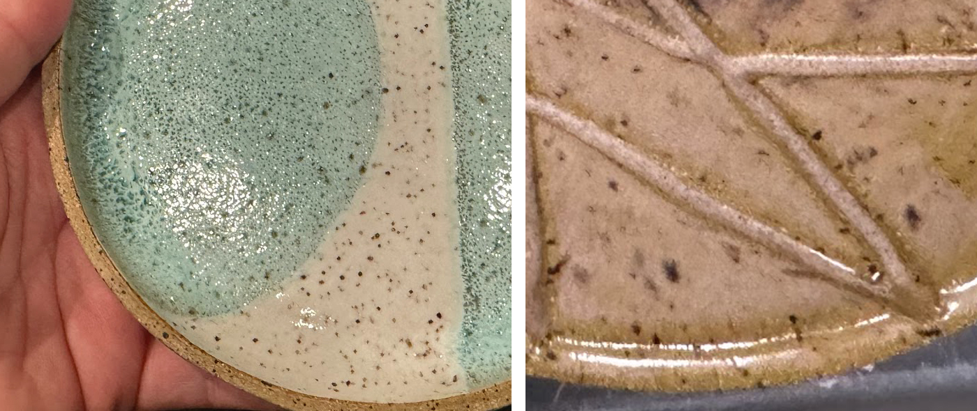
Standard 308 Brooklyn Red:

  • Cone 6: average shrinkage 12.5%, absorption 2.0%
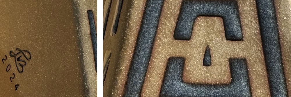
  • Deep brick red/brown color with light-colored fine grog and sand: there's a huge difference between well burnished pieces (seeing less grog makes it look more maroon) and those where grog is at the surface (much more orange looking). Burnished or not, this color is very polarizing at my studio!
  • Turns a murky brown (in my opinion) when covered in clear glaze
  • Very plastic and rehydrates easily and quickly from leather-hard back to plastic
  • A dream for handbuilding with all that sturdy grog!
  • Test glazes for pinholing
  • Marbles well with 112, 211, and 760 - just make sure to dry slowly.
A burnished surface on a slab-built piece made of Standard 308 shows more maroon notes. An unburnished pinch pot of the same clay shows more grog and a more orange brick hue of red.
A burnished, slab-built piece made of Standard 308 on the left vs. an unburnished pinch pot where water was used to bring out the grog on the surface - different tones of red are achieved!

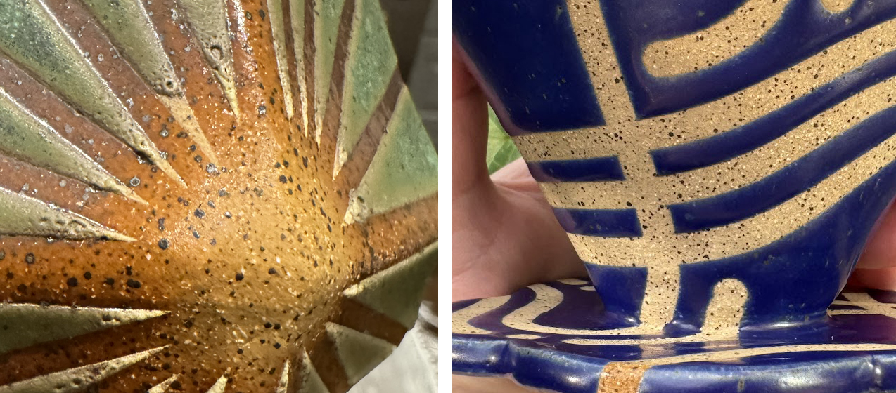
Standard 211 Hazelnut Brown:

  • Cone 6: average shrinkage 12.5%, absorption 2.0%
  • Gorgeous medium brown clay, in my opinion.
  • Has a lot of light colored grog that provides a lovely contrast on the surface.
  • I love how it looks next to blue glazes and other jewel tones: they pop by contrast!
  • Very, very similar working qualities to 308 Brooklyn Red - lots of sturdy grog, very plastic
  • Marbles well with 112, 308, and 760 - just make sure to dry slowly.
Standard 211 has a lovely medium brown color that is accentuated by light grog. The medium denim blue glaze is a great complement to this claybody.
Two examples of the medium brown color and light grog of Standard 211

Indicating coarser Niche Zero grind settings

When brewing filter coffee, it's common to come up against one of the main limitations of the Niche Zero grinder: the Niche Zero has no markings past the 50 mark. Fortunately, there's a really simple solution to this problem:

When the grind size indicator is set to 50, add a small piece of tape above the 0.

Set your grinder to 50 and place a small piece of colored tape on the black calibration ring over the 0 mark. You can now adjust the grinder to create a coarser grind and keep track of where you are by tracking where the tape is. I like to think of this as creating grind sizes between 50 and 100 as the tape marks how much past 50 you've set the grind. To estimate the grind setting number, add 50 to the number marked by tape.

Reversing the Parks Dept. Ban on E-Bikes is a Matter of Equity

Last November, signs banning e-assist bikes were tacked onto Prospect Park's rule signs:

A yellow sign saying no motorized or electric bikes, scooters, and ATVs in three languages appended to Prospect Park's regular green rules sign
The original signs announcing this ban only stated it in English.

I'm in Streetsblog today with a piece about why reversing this arbitrary ban is a matter of equity:

Over Memorial Day Weekend, an infuriating scene unfolded in Prospect Park. A now-viral tweet showed NYPD and NYC Parks officers setting up a sting in Prospect Park, stopping riders on e-assist bikes, including parents transporting toddlers:

According to the tweet, officers were even threatening to destroy the e-assist bikes, which are legal to ride on New York City streets, but have been banned in Prospect Park due to an arbitrary decree from the city Parks Department. This policy is discriminatory and ableist, and harmful to climate goals. Council Members Shahana Hanif, Rita Joseph and Crystal Hudson, whose districts border or include Prospect Park, all agree that Prospect Park needs a thoughtful policy to include e-assist bikes. I also urge Mayor Adams to right this wrong and set an e-assist policy based in fact, not fear, for Prospect Park.

You can read the rest of my opinion piece on Streetsblog.

Why I left Instagram

Content warning: discussion of fatphobia in advertising

Practically overnight, my ads on Instagram went from annoying but benign reminders of capitalism to an utterly dehumanizing nightmare. Suddenly, every third or fourth photo of my friends' latest adventures with their kids, pets, and travels near and far was punctuated with liposuction ads.

Effective immediately, I've stopped reading and posting to Instagram because I refuse to subject myself to repeated messages pushing a potentially deadly procedure because people fear my "unruly" body.

Honestly, I'm disappointed that I've held out for so long here. I've spent a painful amount of time tweaking Instagram's advertising algorithm before by "hiding" ads and blocking accounts so it would stop showing me shapewear and diet apps - something I should never have had to do in the first place. Plus, hatred of fat bodies like mine has always been rampant on Instagram: many highly successful influencers' platforms are rooted in fatphobia, often directly.

I've previously delayed leaving Instagram because I knew I would lose social connections to people I care about, and I will grieve the connections I'm sure to lose. At the end of the day, the responsibility to create a safe platform for people no matter what body they inhabit should not be overwhelmingly borne by the people it harms.

Footnotes

  1. Regrettably, I will not delete my account as I need to maintain my namespace. I've been impersonated on Instagram before and do not want to allow an impersonator to have the username that most people would assume is actually me.
  2. I am lucky that my livelihood does not depend on creating content on platforms like Instagram; others do not share this privilege.

A color palette preview tool for Purl Soho's Mitered Corner Blanket

A fan of my Library Blanket color palette preview tool asked if I could make one for the Mitered Corner Blanket, so I did. This blanket's square building blocks are also made by holding different pairs of yarns together, so this tool can be used to help imagine how a custom yarn palette would knit up.

Side by side view of the Mitered Corner Blanket and my rendering in the Dawn color palette
Photo of the Mitered Corner Blanket in the Dawn color palette from Purl Soho next to my rendering of it. Note that my rendering is rotated 180 degrees as their preview photo is rotated 180 degrees from the schematic diagram included in the pattern. (Photo from Purl Soho used in compliance with the policy in their FAQ.)

The tool will also generate the color list for the yarn names given, so you can easy copy it without the bulk around the input fields.

I've included the original color palettes stated in the pattern, the additional palettes Purl created a year later, and two palettes of my own creation, and you can also create your own palettes either by selecting Purl Soho Linen Quill yarns from the dropdowns or by entering custom yarns in the text and color input fields. For each of the Purl Soho Linen Quill yarns in the dropdowns, I selected a hex color I felt corresponded well to the photo of that colorway. (Of course, a single color doesn't fully capture the subtleties in these yarns, and you may think a different hex color better matches a colorway than the one I chose! If you'd rather use a different hex color for a yarn, you can input it like you would for a custom yarn.) To preview this pattern with different yarns than the two Purl Soho specified in the pattern, you can enter your own yarn names and hex colors.

When you update any of the fields in the tool, the Mitered Corner Blanket rendering and color list automatically update below.

:


or choose your own colors individually:

:
:
:
:
:
:
:
:
:
:
:
:
:
:
:
:
:
:
:
:
:
:
:
:
:
:
:

Mitered Corner Blanket rendering:

Your browser does not support the canvas element.

Color list: