We take good, er at least reasonable, typography for granted all the time. This is especially true when it comes to personal computers because with Microsoft Windows and Mac OS X - upwards of 98 percent of the market - you get characters that are easy on the eye right out of the box.
Let's look at font rendering on Ubuntu. At first glance, it's disappointing. Every time I reinstall Ubuntu, I am bothered of the oddly tall lowercase "l" which is featured on one of the pages on ubuntu.com:

I simply don't find this font rendering as pleasing to the eyes as font rendering on Windows or OS X.
Font Rendering GUI
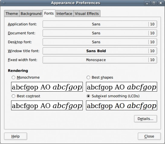
Fortunately, even though fonts aren't as pretty right out of the box in Ubuntu, you can control your font rendering through an easy-to-locate GUI (System → Preferences → Appearance):

A lot of Ubuntu users don't seem to care that much about their font and can be satisfied by playing with the four options in this level of the GUI. The problem is that, unlike the average computer user, many people who switch over to Ubuntu are looking for something other than an operating system that works well when you surf the web or check your email. For those who want an OS that "just works," these four options may not be enough. As someone who (ignorantly?) grew up on Windows, I just couldn't find an option I liked from these four.
Beyond the fact that you don't have quite enough options, it's a lot easier to talk about fonts in terms of hinting, anti-aliasing (analogous to the Ubuntu option for grayscale smoothing), and subpixel smoothing/rendering. These three properties map directly to an aspect of how fonts are rendered on your screen.
Ubuntu's GUI-controlled font rendering options can be described in terms of these properties:
- Monochrome: no smoothing, full hinting
- Best Shapes: grayscale smoothing, medium hinting
- Best Contrast: grayscale smoothing, full hinting
- Subpixel Smoothing (LCDs): subpixel smoothing, slight hinting
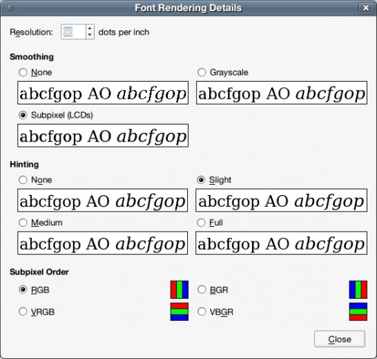
I suggest having Firefox open with a word-heavy webpage you frequent, selecting your favorite of the four options, and then clicking the "Details..." button in the Appearance Preferences GUI, so that you can see what happens when you play around with these properties:

Trial and error really is the best way to figure out what you like. (Note: Changing subpixel order isn't important unless your LCD screen has subpixels in a different order than RGB.) You should make sure to look at a lot of different sized fonts, and if you generally see a variety of fonts, look at a variety of fonts, too.
If you're anything like me, you might be curious as to what each of these three properties actually does and why. I won't include pictures of fonts that are rendered with different properties because different people use differently sized and styled fonts, and these differences are affected somewhat differently by the same rendering options.
Hinting
Hinting, also known as instructing, adjusts the display of a font's outline so that it lines up with a rasterized grid through mathematical instructions. The more hinting, the "crisper" your font appears at small sizes because hinting instructors seek to preserving detail without risking the outline's clarity when rendering fonts. According to the TrueType Reference Manual:
A quality outline font is one that provides legibility at small sizes on low resolution devices and fidelity to the original design at large sizes and on high resolution devices. Chance effects due to interactions between the outline shape and the placement of the grid should be minimized.
I generally do not like hinting, but I know a lot of people who strongly swear by full hinting for all font sizes.
Anti-aliasing
In digital signal processing, the choice of sampling period, ![]() , directly affects the ability to fully reconstruct the original signal. The sampling frequency is defined as
, directly affects the ability to fully reconstruct the original signal. The sampling frequency is defined as ![]() , and if there are frequency components
, and if there are frequency components ![]() present in the original signal such that
present in the original signal such that ![]() , artifacts from the higher frequency components of the original signal distort the version reconstructed from the sampling process.
, artifacts from the higher frequency components of the original signal distort the version reconstructed from the sampling process.
Anti-aliasing is a technique that minimizes the affects of the distortion caused by representing a signal at a lower resolution through sampling. This technique removes the high frequency signal components, ![]() , which would cause aliasing before sampling.
, which would cause aliasing before sampling.
Personally, I like using anti-aliasing for most text. This isn't in the GUI, so you'll need to update your .fonts.conf.
Subpixel Smoothing
Subpixel smoothing uses the fact that each pixel on a color LCD screen is actually composed of individual red, green, and blue subpixel stripes to smooth text with greater detail. If you're still using a CRT monitor, subpixel smoothing probably won't improve your font rendering. Whether or not you enable this property is mostly a matter of personal preference, as it also causes colored pixels to appear around text.
If you do choose to use subpixel smoothing, odds are the default subpixel order (RGB) is what your LCD screen uses; you probably shouldn't change this unless your screen uses a different arrangement.
I prefer not to use subpixel smoothing.
~/.fonts.conf
While you are able to toggle these variables through the Font Rendering Details GUI, you can get a lot more control over your typeface rendering if you use the .fonts.conf XML file in your home directory.
Here is an example of a .fonts.conf file which turns off hinting and subpixel smoothing but enables antialiasing:
<?xml version="1.0"?>
<!DOCTYPE fontconfig SYSTEM "fonts.dtd">
<fontconfig>
 <!-- Turn on antialiasing -->
 <match target="font" >
  <edit mode="assign" name="antialias" >
   <bool>true</bool>
  </edit>
 </match>
 <!-- Turn off hinting -->
 <match target="font" >
  <edit mode="assign" name="autohint" >
   <bool>true</bool>
  </edit>
 </match>
 <match target="font" >
  <edit mode="assign" name="hinting" >
   <bool>false</bool>
  </edit>
 </match>
 <match target="font" >
  <edit mode="assign" name="hintstyle" >
   <const>hintnone</const>
  </edit>
 </match>
 <!-- Turn off subpixel rendering -->
 <match target="font" >
  <edit mode="assign" name="rgba" >
   <const>none</const>
  </edit>
 </match>
</fontconfig>
The above XML handles the lion's share of the work my .fonts.conf file deals with.
While you can control the properties mentioned above through this file instead of the GUI, the real perk of the .fonts.conf file is that you can specify different properties for different font sizes and styles. For example, I prefer hinting without anti-aliasing for very small fonts, and I can control this through the .fonts.conf file.
You can certainly look at a complete manual for .fonts.conf files, but experimenting with parts of other people's .fonts.conf files is also useful because there isn't a right answer to questions of personal preference. Unfortunately, tweaking font rendering to your complete satisfaction often takes a non-trivial amount of time.